We submitted a new version of Gluroo (1.3.75) to the App & Play stores earlier today – it should be available soon. Read on to learn what has changed…
Status Tabs are Gone but the functionality remains!
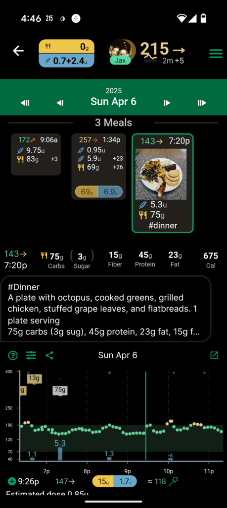
This new version removes the status tabs that were prominently displayed at the top of the Gluroo Event Log. The new main log looks like this now, without those tabs:
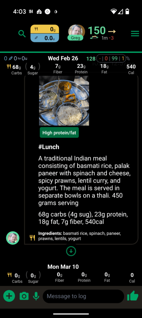
But do not fear: the drawers that those tabs opened are still available.
For the IOB/FOB (Insulin On Board and Food On Board) details, tap the yellow and blue pill in the top left of the header. The detail popup is shown below, too.
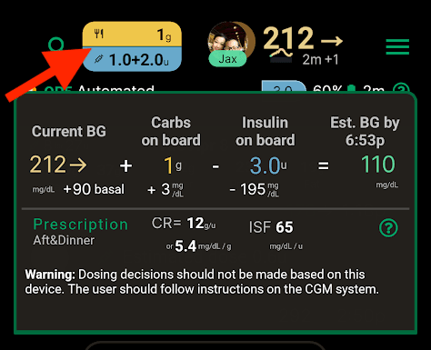
IOB/FOB Details Popup
For the Chart, tap the Blood Sugar value (i.e., the CGM number) in the top right of the header. You can still pin this using the pushpin icon inside the popup.
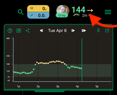
Chart Details Popup
Finally, the Devices tab is now available as a screen under Menu > Devices & Integrations > Status:
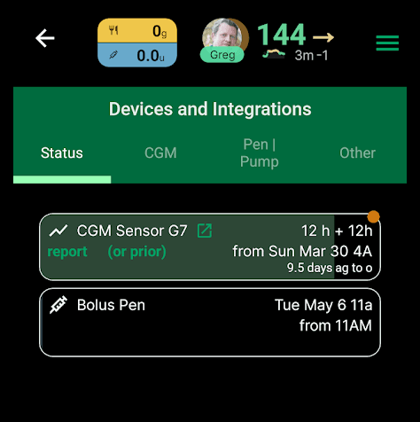
New “Status” tab of Devices & Integrations screen
That page shows all of the devices/pens/vials you’ve logged using “new sensor”, “new site”, “new pen”, “new vial” (or using the + menu’s “New …” button). If any of those items are scheduled to expire within 24 hours, compact summaries of the time left for those soon-to-expire items is shown just below the main header:
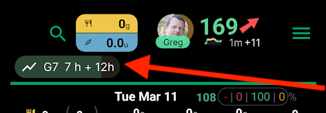
Expiry view shows a G7 sensor that is expiring in 7h with a 12h grace period (in 19 hours total – only shows when the total including the grace period is less than 24 hours)
Release Notes when upgrading the app
When you update to a new version of the mobile app, Gluroo will now alert you that you’re using a new version and provide a link that goes to the Release Notes hosted here at https://gluroo.com/releases
Gluroo will also alert you to the existence of a new release using a call-to-action banner at the top of the Gluroo Event Log.
Menu Changes
We’ve upgraded the look and rearranged the menus a little bit. There’s no longer a specific “Profile” menu item — you can get there from Menu > GluCrew (Pencil icon next to your name) or using the new “My Profile” link at the top of the GluCrew switcher that you get by tapping the header profile photo (of the primary user):
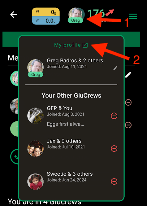
GluCrew switcher’s new “My Profile” button. This is now available even if you’re only in one GluCrew (and Gluroo makes it easy to be a part of multiple GluCrews if you like).
The new menu looks like the below, with some color changes to make it look nicer. We’ve replaced “Day by Day” with Insights and renamed “Status” to Heads-Up Display. Finally, our “Care Teams” option is now adjacent to Help and is called Share to Care Teams – we were getting lots of requests from people about how they share their Gluroo data with their Doctor, their Clinic, a Registered Dietitian, the school nurse, and other care teams. We hope the addition of “Share to” will help make it more clear that this is how. Note that they will not need to install the Gluroo app to review your data; they simply use the web app version of Gluroo available to them (and you!) at https://app.gluroo.com (log in with your usual credentials that match what you use on your mobile phone).
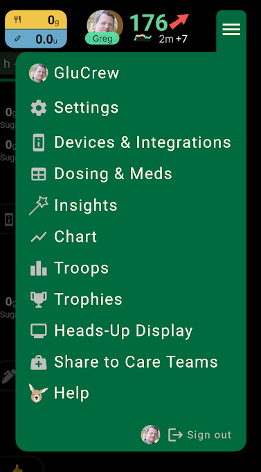
New Gluroo Simple Menu
For those of you not using Insulin, there are some small changes (for example “Dosing & Meds” is just “Medications” for you.)
Insights and Trends
Back in December we introduced our day-by-day summary view. That view is now accessible via the new Insights menu item that takes you to a list of the insights views that we’ve rolled out so far.
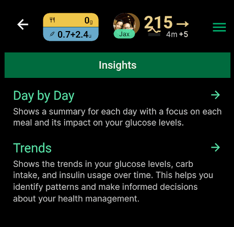
Insights available so far… more to come!
The “Day by Day” is the same as the previous “Day by Day” Menu item and looks like this:
Day-by-day Insights in Gluroo, highlighting meals and their impact on blood sugar
The second, and new, insight screen is called “Trends” and shows how your average blood sugar, your total carbs for a day, and total insulin for a day, have changed over the last 7, 30, 60, or 90 days:
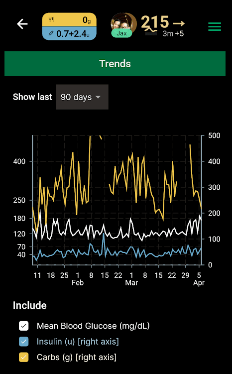
New Trends screen showing recent average blood glucose, total insulin/carbs per day
CGM Arrow Colors
With this release, we’re trying something new with how we display CGM Trend Arrows. The blood sugar values themselves have always been colors based on whether their low (red), in-range (green), or high (orange/yellow). Historically, we’ve always shown the trend arrow using the same color as the arrow.
Now, Gluroo shows the trend arrows in a potentially different color based on whether the arrow represents the right directional trend for your blood sugar number. For example, consider these 3 log entries:
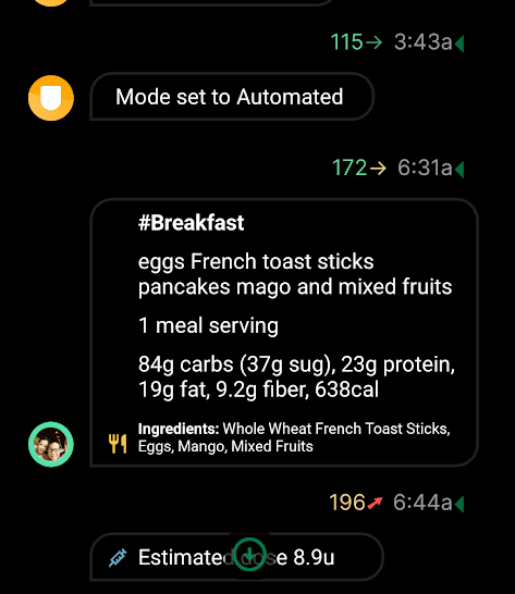
The first 115→ has the arrow green because the reading is in-range and the trend is stable (what you want when you’re in range).
The second 172→ has the arrow in orange/yellow because the reading is on the high side of in-range and is not yet coming down.
The third 196↗ has the arrow in red because the reading is already high out of range and the trend is the opposite of what you want for that value.
… and much more
This release has several bug fixes, including trying to fix a number of problems with the Custom Intervention Snack capabilities (thanks Rolf for the bug report!)
The diagnostics sent to us when you send us email from Menu > Help > Email now includes more information about which integrations you’re using so we and our AI chatbot support responder can help you better and faster.
The Stat card at the bottom of the Gluroo Event Log (GEL) for “Avg BG” now supports 4 different time ranges: 24h (like before), 3 days, 14 days, and 30 days.
Let us know what you think of these new features and this release by joining our Facebook Gluroo Diabetes Logger User Community and commenting there.
Please also remember to Like our Gluroo Diabetes Logger facebook page, and do share this URL with others who might benefit from Gluroo or who may have tried Gluroo long ago and should give it a second look.